Virtual Embossing Software
June 3, 2019
My friend Ed Ho makes paper art over on his youtube channel and we are currently roommates (summer ‘19). He’s been working on a series of projects making embossings using layered cutouts of paper that he designs in Adobe Illustrator and cuts out either by hand with an Xacto knife or with his Silhouette Portait. The trick was he would make the 3d cavities out of the empty spaces in that paper, then he would push thicker paper into the negative space to leave an embossed positive on the surface. Check out one of his pieces here.
His overall project was to make a poster design and corresponding embossing for each of the Studio Ghibli films–My Neighbour Totoro, Spirited Away, etc. Each iteration of his design took over an hour to tweak, print, glue, and press. And he would often have to go through multiple iterations to perfect each design. And since there are 24 Ghibli films, I figured this was a job for Software Engineering™!
I have a summer’s worth of experience doing computer graphics / image processing work for Waylens, so since I know my way around OpenCV I was able to put together a decent script that would simplify Ed’s life and in his words, “Change the game” for his design workflow during this and other embossing projects.
The script accepts an image of his design and approximates what the final embossed paper would look like. It performs well enough that he can skip several laborious steps in the design process and just focus on the aesthetics. It also allows him to take risks and compare lots of different options because now there’s little cost to try random changes, whereas before it would have wasted over an hour if he made a mistake in the design phase.
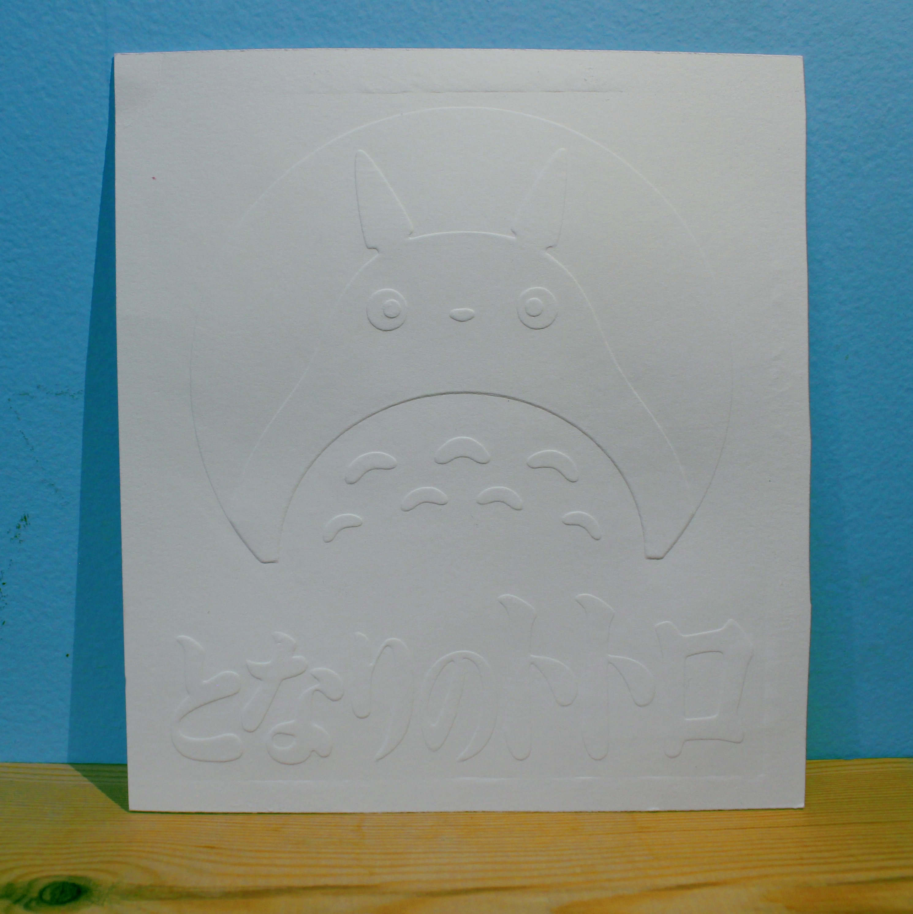
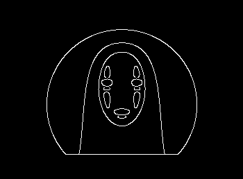
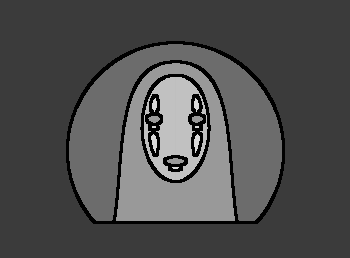
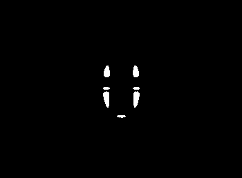
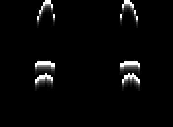
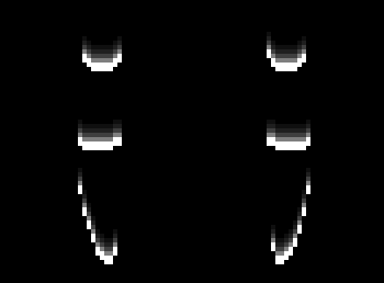
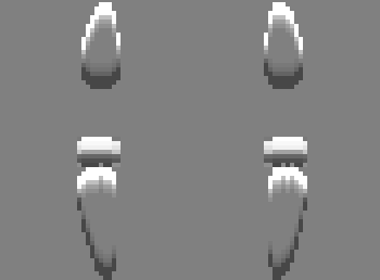
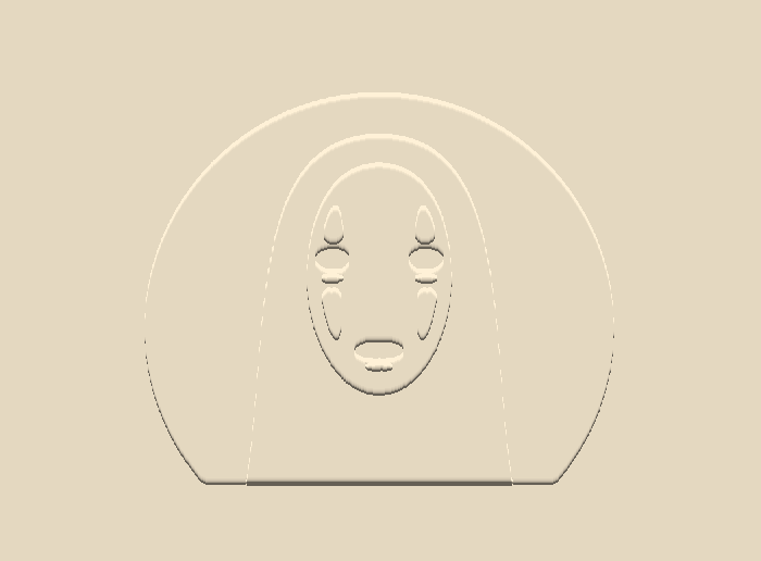
Here’s some sample output for a Totoro poster before we get into the code. The left is the layers that go into the program, the middle is the output of the program, and the right is the final version after pressing the paper through the mold.


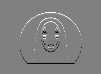
I wanted to make the program as simple to use as possible, so the input could just be a simple screenshot of his work during the design phase. However, this means that some information about the layers in the design would be missing. Even more troublesome, information about the edges in the image is also destroyed when moving from the vector to raster world. Luckily, Ed was already using the saturation of the color in a given layer to denote its depth to him visually (see the leftmost Totoro above). So the program can use this hint in the opposite direction to distinguish the different parts of the design by the saturation channel of the HSV image.
With that in mind, the first thing the code does is read in an image corresponding to the input from the command line and change its color space to HSV (Hue, Saturation, Value).
img = cv2.imread(args.filename)
hsv = cv2.cvtColor(img, cv2.COLOR_BGR2HSV)
h, s, v = cv2.split(hsv)


Now we’re ready to start figuring out what saturation levels exist in the most prominent numbers and interpret those (with reasonable cutoffs) as the different layers of the image. First I collected a histogram of all the saturation values in the image. Then I used scipy’s find_peaks function to locate the most frequently appearing values.
val_count = [0]*256
rows, cols = s.shape
for i in range(rows):
  for j in range(cols):
    val_count[s[i,j]] += 1
val_count[0] = 0  # since I'm masking off the noisy regions aka setting them to 0
colors, _ = find_peaks(val_counts)
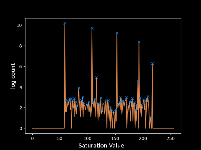
If I plot this right away I can visually make out most of the peaks that correspond to the different layers in the image, but the last one is almost completely washed out by noise. The program might work for this image with the right parameters plugged into find_peaks, but I’m not sure that this would work for every image and it’s not clear what those parameters should even be for this one. Some more pre-processing will be necessary before applying find_peaks.
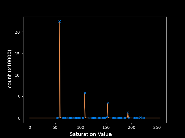
The plot shows that regions in the image have approximately exponentially decreasing areas. This fits a model of cartoony and simplified artwork, where there are large areas of solid color and some areas with more detail. This motivates taking the logarithm of the counts to make all of the peaks closer together so I can operate on them in parallel more effectively. Unfortunately, this magnifies the noise relative to the larger peaks.
The next step is clearly to remove this noise. Since the noise is spread across the spectrum, it must not be coming from inside a solid region where the noise would be localized around a discrete saturation value. Instead, the noise exists mainly at the turbulent edges of these regions, where smoothing from Adobe Illustrator’s rastering and artifacts from the screen capture’s JPEG compression allow pixels to take on any value between those of the regions they border.
In order to detect the edges, I will use a canny filter to find the places with the maximum gradient on the S channel. I chose the thresholding on the canny filter (0,50) to trigger on just about any edge since each layer is approximately a single value so there shouldn’t really be any rogue curves in undesirable regions. I applied a Gaussian blur beforehand to smooth the high-frequency noise that occurs pixel-to-pixel and leave just the most important edges that occur between solid regions. I then used a dilated version of the detected edges to mask off the fuzzy pixels near the edges. To make the color counts as clear as possible I was finally able to eliminate them.
# apply Canny filter
blur = cv2.GaussianBlur(s, (3,3), 0)
edge = cv2.Canny(blur, 0, 50)

# filter out noise at the edges
kernel = np.ones((3,3),np.uint8)
mask = cv2.dilate(edge, kernel, iterations=1)
filt = cv2.bitwise_and(cv2.bitwise_not(mask), v)
The resulting plot is much more promising. However, after applying the mask, the smallest regions got even smaller and now their area is so small that the noise in that region of the colorspace is still significant.
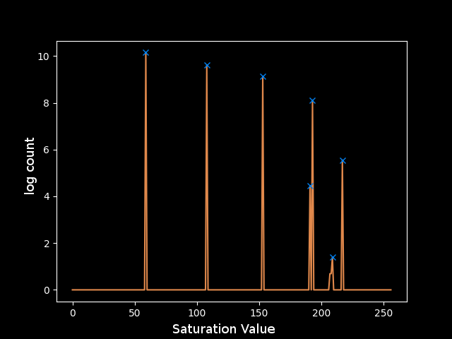
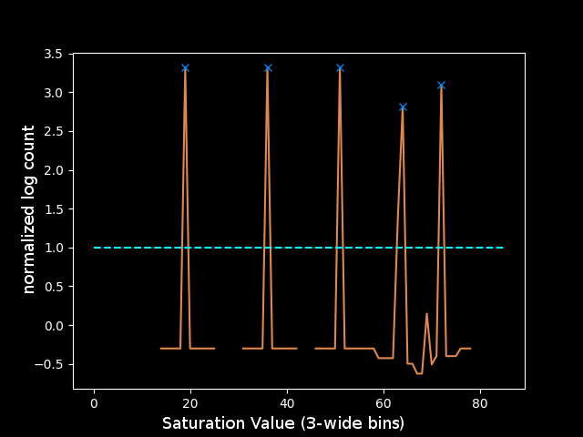
The final step to clean these peaks was to use one more assumption about the input image: that the levels are reasonably spaced in the color space. This justifies taking the z-score of each peak relative to a window around that saturation value to determine how significant its count is. Another trick was limiting the number of buckets to 128 or 64 since the peaks should be spaced far enough apart to be placed in different buckets, and any noise close to those values would get absorbed into the bucket instead of being its own peak. Both of these tricks led to a much cleaner plot, for which it was clear how to choose the parameters for find_peaks. I decided that if the height of the peak was greater than 1, meaning it was at least a standard deviation above the mean of the window around it in the color space, then the value was reasonably outlying and could be considered a peak. This rule yields the following peaks which correspond perfectly to the levels in the test image:
I can grab just the parts of the image in the colorspace window around each peak using inRange. That gives me four layers:
lowc = np.array([0, colors[i]-15, 0])
highc = np.array([255, colors[i]+15, 255])
layer = cv2.inRange(hsv, lowc, highc)


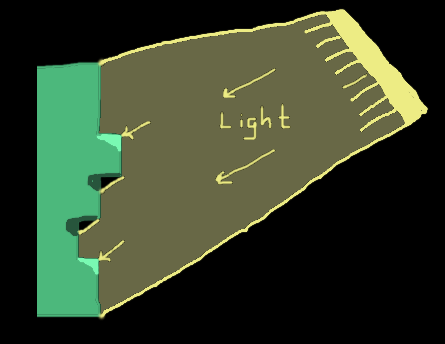
Now that the image has been split into layers, I can finally move onto what the program is supposed to be doing with them. The program should simulate stacking the layers, and we can imagine each layer being a unit step deeper than the one above it. Then, when a paper is pressed through this mold, the deepest layer will correspond to the highest point in the final embossing (if this didn’t make sense, just watch Ed’s video where he makes one here. So one way to draw the virtual embossing would be to create a 3d model and set up a virtual lighting and a camera and use raycasting… That’s too complicated so I made an assumption that the light source was coming from in front and above the paper. Therefore there should be a highlight at each positively sloped region in the y-direction and a shadow at each negatively sloped region in the y-direction.
Since we only need either a highlight or a shadow at each edge, the current layers won’t work as they double-count each edge. Instead, each layer should represent all of the regions of the paper are at that height or higher, and I can do this with a simple reversed loop over the layers to add the one above it each time. I also found it was necessary to do a “closing” since the noisy pixels at the edges was not always captured by the inRange calls of the two layers they bordered, leaving some black pixels between the two white regions. The closing just dilates the image, and then contracts it with the same kernel, and this usually closes small holes like that.
composite = cv2.bitwise_or(layer, upper)
if i != len(colors)-1:
  composite = cv2.morphologyEx(composite, cv2.MORPH_CLOSE, kernel)
upper = composite

Consider just the deepest layer, since that one has the most detail so it’s the most interesting to look at. I need the vertical gradient of the image, so I can use the Sobel filter in the y direction. Here, I used a trick that the cv2.CV_8U can only store positive numbers, so the first line below grabs just the positive slope edges, and the second line grabs just the negative slopes.
sobel_ypos = cv2.Sobel(composite, cv2.CV_8U, 0, 1, ksize=1)
sobel_yneg = cv2.Sobel(cv2.bitwise_not(composite), cv2.CV_8U, 0, 1, ksize=1)

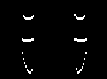
Then to simulate the highlight, I will simply copy the positive edge, shift it down, decrease its brightness, and add it in again, repeating this until the brightness is negligible. I’ll do the same for the shadows with the negative edge, except shifting up each time. Finally I add the highlight image to a 128 offset and subtract the shadows, yielding the rightmost image.
S = 5
highlight = np.uint8(sobel_ypos)
shadow = np.uint8(sobel_yneg)
for j in range(1, S):
  txlate_down = np.float32([[1,0,0],[0,1,j]])
  txlate_up = np.float32([[1,0,0],[0,1,-j]])
  hl_shift = np.uint8(cv2.warpAffine(sobel_ypos, txlate_down, (cols,rows)) / (2**j))
  sd_shift = np.uint8(cv2.warpAffine(sobel_yneg, txlate_up, (cols,rows)) / (2**j))
  highlight = hl_shift + cv2.bitwise_and(cv2.bitwise_not(hl_shift), highlight)
  shadow = sd_shift + cv2.bitwise_and(cv2.bitwise_not(sd_shift), shadow)
result += highlight // 2
result -= shadow // 2
I similarly make highlights and shadows for each of the layers and add them up to get the full stacked image. I wanted to display an image that looked like it was actually embossed on paper, so I interpreted the stacked image as the value channel of a new image with the hue and saturation left as free parameters to try to get a papery / cardstock look. I chose H=72deg and S=40% and it looks pretty good compared to the actual paper version.
h = np.full_like(v, 20)
s = np.full_like(v, 40)
v = cv2.add(result, 100)
hsv = cv2.merge((h,s,v))
bgr = cv2.cvtColor(hsv, cv2.COLOR_HSV2BGR)
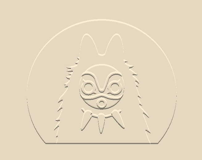
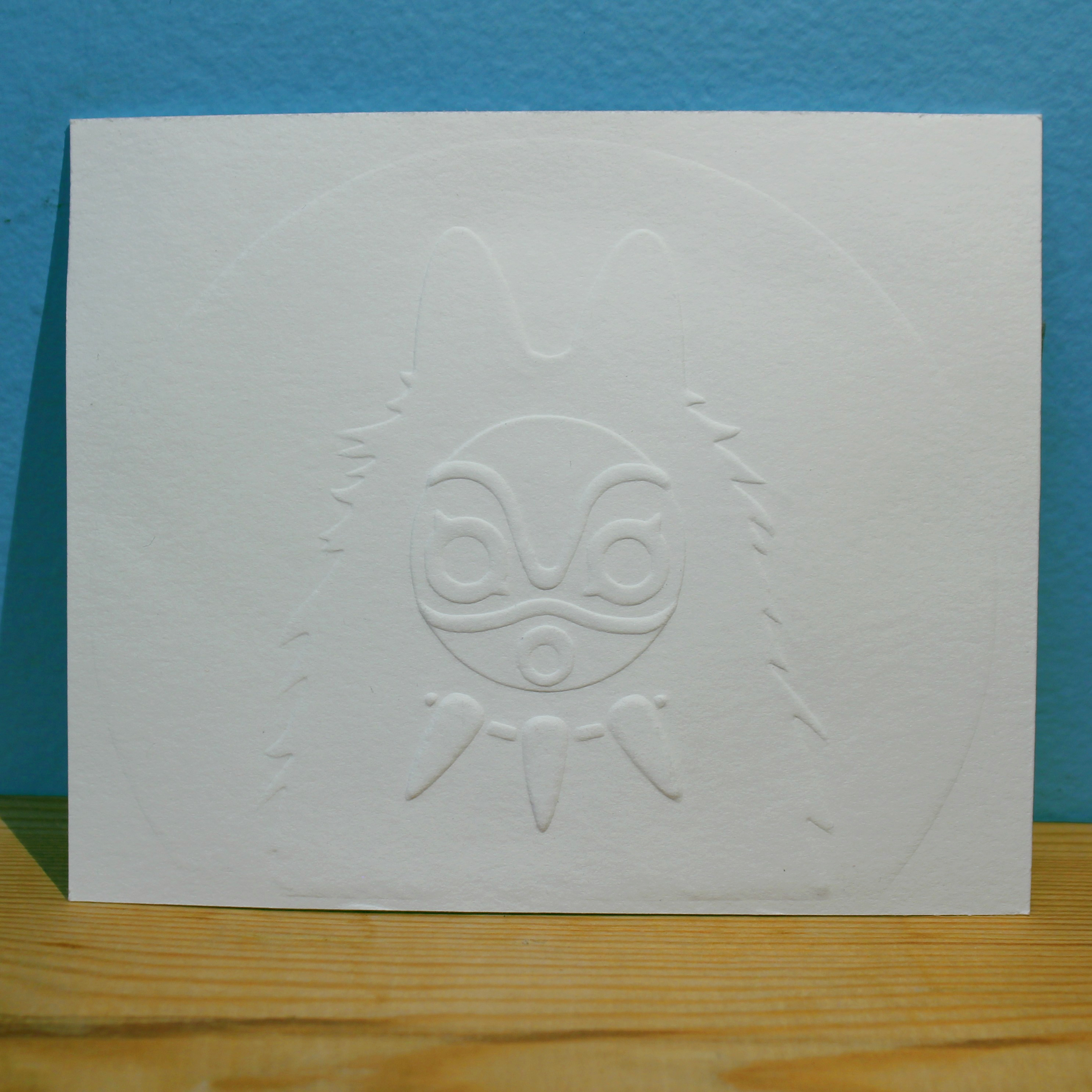
Thanks for reading! Check out the github repo for this project for the full code here, and also take a look at Ed’s other projects because he makes cool stuff. Before you go, here is another example of the program output vs the final paper version for a Princess Mononoke poster: